11 Pink Gaming Setup Ideas That Don't Look Cheap, and Why Most Do!
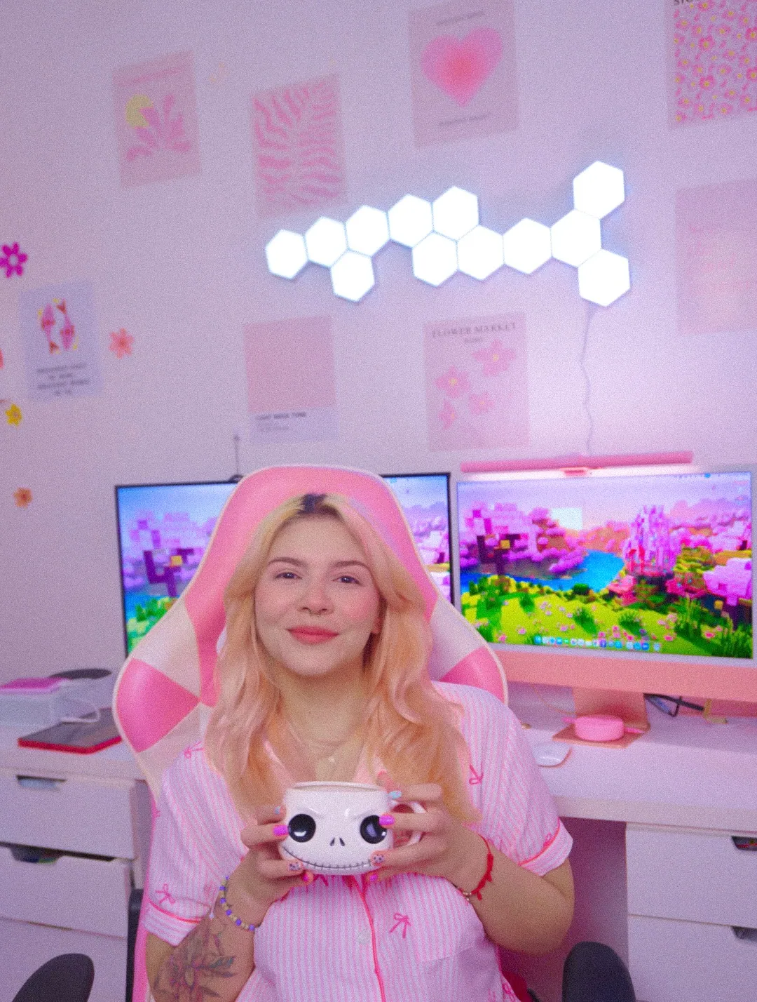
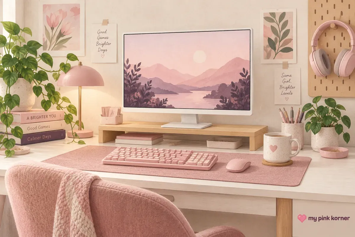
Two pink desks can contain the same objects and one of them looks expensive. The difference is almost never the money. It's finish, saturation and material, in that order.
I know because mine looked cheap for about a year and I couldn't work out why. I kept buying better versions of the same thing, in the same glossy plastic, in the same bright pink and wondering why it still read like a toy aisle.
So this isn't another list of ideas. It's eleven rules about what actually makes pink look considered, with the research behind each one, because it turns out this has been studied properly and nobody in this corner of the internet has mentioned it :D
🎀 A closer look from the corner
Watch this post on Instagram ↗
Rule 1. Matte instead of glossy, and the reason isn't taste
A glossy pink object reads as younger than the identical object in matte. That's a measured effect rather than an opinion.
A 2025 study in Marketing Letters ran four experiments on product surface finish and found that consumers perceive glossy products as more suitable for youthful consumers and matte products as more suitable for mature ones. Gloss carries an association with newness and novelty. Matte carries an association with maturity.
On most products that's neutral information. On a pink desk it's the whole problem, because pink already sits close to childhood in most people's heads, and a high-gloss finish pushes it the rest of the way.
There's a second, purely optical reason. Gloss changes how a colour actually appears, not just how it reads. As HunterLab puts it, a high-gloss sample looks more chromatic and darker than an identically pigmented sample with less gloss, while a matte surface scatters the white specular light and looks lighter and less saturated. Two objects made from exactly the same formulation can look like different colours because their gloss levels differ.
The practical version: given the same thing in matte and gloss, take matte.
Rule 2. Turn the saturation down
Less saturated pink reads as more expensive, and there's a number attached.
Research published in the Journal of Consumer Research in 2025 ran seven studies on colour saturation and perceived brand status. The finding: lower saturation increases perceived status, and it does so because people associate desaturated colour with the passage of time, which reads as heritage. The first study tested nine saturation levels and found the effect kicks in somewhere between 20 and 30 percent saturation.
That's why dusty rose, blush and mauve look expensive and bubblegum doesn't. One of them looks like it's been there a while.
The honest complication. Separate research in retail found that higher saturation increases perceived performance. So hot pink reads as faster and dusty rose reads as more expensive, which on gaming gear pull in opposite directions. I want the second one. If you want the first, ignore this rule.
Rule 3. Put the pink on the soft thing, not the structure
This is the rule that changed my own desk more than anything else on this list.
Here's the practical reason it works: the premium versions of hard desk objects aren't manufactured in pink. Wooden monitor risers come in oak and walnut. Anodised aluminium comes in silver, black and space grey. The good stuff is neutral because the people who make it are selling the material rather than the colour.
So the setup that looks expensive is pink on the large soft surface, neutral on the structure. One big pink plane, and everything holding it up staying wood, metal or white.
Auhoahsil Felt Desk Mat at 35.5 inches, or a merino wool felt pad at 14 by 33 inches, is the version I'd build around. Wool felt is matte by nature, it has genuine thickness and the premium reference point in this category runs about 3.5 mm against roughly 2 mm for a budget PU mat. You can feel that difference with a hand.
TONOS XXL Pink Leather Desk Mat at 35.5 by 15.4 inches is the leather-look version if you want something wipeable.
Then the structure stays neutral: a cloud shaped wooden monitor riser or a two tier wooden one. Wood, not pink plastic.
Rule 4. Buy materials, not finishes
Dieter Rams put this better than I can. His sixth principle of good design: "Good design is honest. It doesn't make a product more innovative, powerful or valuable than it really is."
Pink plastic printed to look like marble is dishonest in exactly that sense, and it's the single most common cheap-looking object in this category. So is plastic chromed to look like brass. The pretending is what you're reading when something looks cheap.
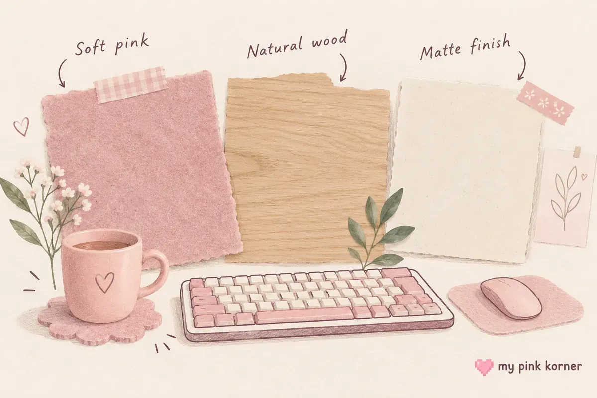
Pink felt that's felt looks fine. Pink ceramic that's ceramic looks fine.A ceramic mug reads as more considered than a plastic cup of the same shape, because ceramic has weight and a glaze rather than a print.
And there's a durability version of the same argument. Painted pink plastic chips, and underneath the chip is grey. Anodised aluminium can't do that: the Aluminum Anodizers Council describes the oxide as fully integrated with the underlying metal, so it can't chip or peel. Powder coating is similar, a dry finish that the Powder Coating Institute describes as more durable than liquid paint and resistant to chipping and fading.
So the rule is: if it's coloured metal, look for powder coated or anodised. If it's coloured plastic, accept that it'll chip eventually and buy it accordingly.
Rule 5. A patterned surface counts as clutter
This one is a genuine finding and I haven't seen it applied anywhere in this niche.
Research published in the Journal of Vision in 2026 examined what actually drives the perception of visual clutter and found three factors: how many items there are, how they're arranged and the complexity of the surface they sit on.
That third one is the interesting one. A busy desk mat makes a desk look cluttered even with nothing extra on it. A floral print, a marble print, a galaxy pattern, a full-width photographic design: all of them add measurable visual complexity before you've put a single object down.
So a plain matte mat isn't just a taste preference, it's a clutter reduction. And it disqualifies a whole category of pink product that looks great in a listing photo and busy on a real desk.
The same logic is why a clear acrylic riser beats a pink one. Clear acrylic disappears, which means it adds no fifth pink and no extra surface complexity to a desk that already has enough of both.
Rule 6. Pick one pink and let it repeat
Two or three pink tones on a neutral base, and the same tone appearing in more than one place.
Repetition is what makes a colour scheme read as a decision. One pink object is an accident. The same pink appearing on the mat, on a shelf and on the wall is obviously deliberate and deliberate is most of what expensive means.
Rule 7. Let the light do the colour instead
The most sophisticated pink setups I've seen are mostly neutral objects lit pink.
This dodges the shade matching problem entirely, because light is one colour by definition. It also means the desk reads as clean in daylight and pink at night, which is two rooms for the price of one.
A pink neon-style LED rope light along a shelf edge or the underside of the desk gives you glow with no visible source, which is the effect people are actually chasing. Hexagon light panels do the wall version.
Run it low. Around a third. This is where saturation rule two applies to light rather than objects: a room at full RGB brightness looks like a display stand and the same room at a third looks like somewhere a person lives.
The task light is the exception and it should stay white. The Quntis Pink Monitor Light Bar is a pink object that makes white light at Ra95, which is the combination that makes everything else on the desk photograph as its real colour. There's a whole system to this in my cozy gaming lighting guide and a comparison of the bars themselves in the pink monitor light bar guide.
And a warm lamp at 2700K to 3000K does more for how a room feels than any pink object in it. A cordless pink lamp is the version with no cable to hide.
Rule 8. Neutral hardware, every time
Cable clips, ties, hooks, brackets and stands should be white, black or metal. Never pink.
Pink hardware is the tell. It's the thing that says somebody bought pink because it was pink rather than because it was right, and it's the cheapest looking category of object you can put on a desk.
White silicone cord clips on a white desk disappear. Pink ones announce themselves and then clash with whichever pink is next to them. A cable management sleeve in black or white does the same job invisibly.
The exception is when the hardware is the decoration.A pink bow garland isn't hardware, it's an object and it's allowed to be pink.
Rule 9. Height instead of quantity
A crowded desk looks cheap regardless of what's on it. The fix isn't fewer things, it's putting things at different heights so each one has a reason to be where it's.
Anything on a riser, a shelf or a hook reads as a display. The same object lying flat reads as stuff. A pegboard moves the storage off the surface entirely, and a trail of faux ivy along a shelf edge softens every hard line under it without adding a single object to the desk.
And the free version, which beats all of it: take everything off the desk, then put back only what you picked up in the last seven days. Whatever is left goes on a shelf. That did more for my desk than anything I bought that year.
There are thirty-three more of those in 34 pink gaming setup ideas, nine of which cost nothing.
Rule 10. Hide the cables before you buy anything else
No amount of good taste survives six visible cables. This is the rule I'd enforce before any of the others, because it costs nothing and it changes every photograph.
The order is bundle, shorten, move the power strip, then hide what's left. The full thirteen method version is ranked by what each one costs your desk, and the weekend version puts it in the right place in a two day plan.
Rule 11. The named shades, and what they signal
The shade names aren't arbitrary and the language around them tells you exactly what each one signals.
Millennial pink was named by Véronique Hyland in The Cut in August 2016, and her own description is the useful part: a muddied, faded version of pink, explicitly softer than Barbie pink. It reads as expensive because it's desaturated, which is rule two in a word.
Compare how Pantone itself writes about two of its own pinks. Rose Quartz, the 2016 Colour of the Year, is described as a persuasive yet gentle tone conveying compassion and a sense of composure. Viva Magenta, the 2023 Colour of the Year, is described as brave and fearless, electrifying and promoting self-expression without restraint.
Composure against electrifying. Same company, same product line, completely different register and it maps precisely onto saturation. That vocabulary gap is the clearest guide to what a shade will signal on your desk that I've found anywhere.
| Reads considered | Reads loud |
|---|---|
| Dusty rose, blush, mauve, millennial pink, rose quartz | Hot pink, bubblegum, magenta, fuchsia |
Neither is wrong. But if your goal is a setup that doesn't look cheap, the left column is doing that job and the right column is doing a different one.
Where I'd start
Matte felt mat, neutral structure, one pink tone, cables hidden, ceiling light off.
That's the whole thing in a sentence and four of those five are free or nearly free. If I could only change one item, it would be swapping a glossy pink object for a matte one of the same colour, because that's the change that costs the least and moves the most.
The mistake I actually made was buying more pink things when what the desk needed was fewer, softer, quieter pink things and better light on them. It took me about a year and four slightly different pinks to work that out.
If you want the long list of ideas rather than the rules behind them, that's the 34 ideas page linked above. The 12 things that actually matter is the buying order for a setup from scratch, and my own desk is where all of this ended up, including the bits I'd change.
Everything I currently own is on my faves, there's more about me on my about page and if you're buying any of this for somebody else, the price band gift guide sorts it by budget.
Pink setup FAQ, the questions I get asked most
How do I make a pink gaming setup that doesn't look cheap?
Choose matte over glossy, choose a desaturated pink over a bright one, put the pink on one large soft surface rather than on every object, keep the hardware neutral and hide the cables. Those five do most of the work.
Why does my pink setup look childish?
Usually gloss and saturation together. Research on product finish found glossy products are perceived as more suitable for younger consumers, and a bright saturated pink compounds it. The same objects in matte and a softer shade read completely differently.
What shade of pink looks most expensive?
Desaturated ones. Dusty rose, blush, mauve and millennial pink all sit in the range where research found perceived status increases, somewhere below about 30 percent saturation.
Should my desk mat be patterned?
No, if the goal is a setup that looks considered. Research on visual clutter found that the complexity of the surface objects sit on is one of three measured drivers of clutter, so a printed mat makes a desk look busier before you put anything on it.
Is pink plastic always going to look cheap?
Not always, but matte plastic reads far better than glossy and painted plastic will eventually chip to grey underneath. Powder coated or anodised metal can't do that because the colour is part of the surface rather than sitting on it.
How many shades of pink should I use?
Two or three, on a neutral base of white, cream, wood or grey. The count of shades matters more than the count of objects.
Can I have a pink setup without buying pink things?
Yes, and it's one of the better looking versions. Neutral gear lit with pink light gives you a room that's pink at night and clean in daylight, and it avoids shade matching entirely.
What's the cheapest change that makes the biggest difference?
Turning the overhead light off and hiding the cables. Neither costs anything and together they change every photograph of the desk.