How to Match Pinks, and Why Two That Matched Online Clash on Your Desk!

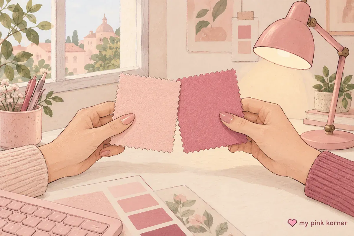
Two pinks that looked identical in the listing photos can sit next to each other on your desk and obviously not match. This happens constantly, and it's neither your eyes nor bad luck.
It has a name. It's called metameric failure, and it means two colours that hit the same value under one light source come apart under another. Colour scientists measure it. Paint companies budget for it. Nobody in this corner of the internet mentions it, which is why everybody thinks they're the only one it happens to.
Three of the pinks on my desk are a slightly different shade from the rest, bought from four sellers over four months and I never held two of them up next to each other. So this is the page I needed before I started.
🎀 A closer look from the corner
Watch this post on Instagram ↗
Why two pinks stop matching, properly explained
Every colour you see is a light source bouncing off a surface into your eye. Change the light and you change the answer.
The international lighting standards body defines metameric colour stimuli as spectrally different colour stimuli that have the same tristimulus values. In plain English: two objects with different fingerprints that happen to land on the same colour value.
The failure is the interesting half. RMIT University's colour theory textbook puts it cleanly: when colours that should be the same are perceived differently under different light, that's metameric failure.
Three flavours of it, separated neatly by Datacolor:
| Type | What changes |
|---|---|
| Illuminant metamerism | The light. Two samples match under one source and not another |
| Observer metamerism | The person. Two samples match for one viewer and not another |
| Geometric metamerism | The angle. Move your head and the match breaks |
X-Rite describes the mechanism in a way that stuck with me: two metameric samples have reflectance curves that cross at least three times. They agree at a few points and disagree everywhere in between, so the light you use decides which points you see.
The everyday version: the mat and the keycaps both looked pink under the lights that photographed them. Your bedroom lamp isn't those lights.
Pink is uniquely fragile, and here's why
This is the part I haven't seen anyone put together, and it explains why this happens to pink far more than to blue or green.
Pink isn't a spectral colour. There's no wavelength of pink light. Green has one. Blue has one. Pink exists only as long-wavelength red and short-wavelength blue arriving together, which is why it sits on the line of purples rather than the spectral curve.
So pink depends on both ends of the spectrum at once. A green object needs the light to be honest in one region. A pink object needs it honest in two, and a shortfall at either end shifts it.
Now the second half. Consumer LEDs are weak at the red end. Waveform Lighting documents a notable lack of red light past 600 nanometres against a daylight reference.
Put those together and the whole problem fits in one sentence: the spectral region pink depends on is the region cheap LED lighting is worst at. Which is why your pinks look right by the window and wrong under the desk lamp.
The R9 number nobody publishes
Here's the specification that would tell you whether a light will treat pink honestly, and almost no manufacturer prints it.
Colour rendering index, or CRI, is the number on the box, reported as a single average written as Ra. The catch, from the US Department of Energy's own fact sheet: CRI averages the scores for the eight standard test colours.
The strong red sample is R9, and it's not one of the eight. It sits outside the average entirely. A lamp can score a perfectly respectable Ra 85 while rendering saturated reds and pinks badly, and the number on the box won't tell you.
How low is the floor? ENERGY STAR requires solid-state lamps to have Ra of 80 or above, and for R9 it requires only that the value be greater than zero. Greater than zero is a pass.
What to look for, using the industry's own guidance: R9 of 50 or above is good and 90 or above is excellent. Manufacturers who measure well tend to publish. An unpublished R9 is a soft answer in itself.
The test colour scientists actually use
This is the most useful thing on this page and it costs nothing.
Konica Minolta publishes best practices for visually comparing colour samples, which is what people do professionally before a production run. Every rule translates to two pink things on a desk.
| The professional rule | What it means for you |
|---|---|
| Hold the samples parallel and touching | Two pinks an inch apart look like they match. Touching, they don't |
| Lay them flat, or at 45 degrees | Same angle for both. Never one flat and one upright |
| Reverse their positions, left to right and top to bottom | Swap them and look again. Differences move |
| Judge in 5 to 10 seconds | Your eye adapts. After ten seconds you're agreeing with yourself |
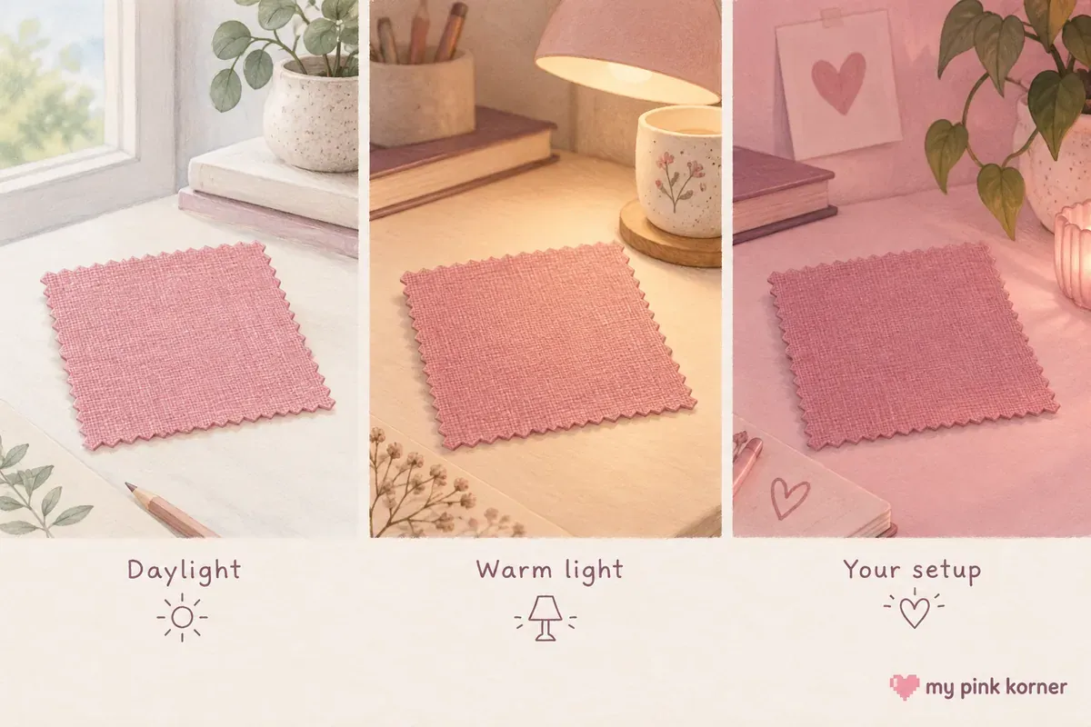
| Compare under at least three light sources | Window daylight, your warm lamp, your RGB setting |
| Put nothing else in the field of view | Other colours change what you see |
The five to ten seconds rule surprises people. Colour sensitivity drops the longer you stare, so a long comparison is less accurate than a quick one.
The practical version for buying: when a new pink thing arrives, take it and the thing it has to match to a window, hold them touching, look for five seconds, swap them, look again. Then repeat under your desk lamp with the curtains shut. If they disagree between those two, they'll disagree forever and that's a returns decision rather than a lighting problem you can fix.
Warm pink against cool pink, and how to tell
Most clashes are a warm pink next to a cool one. Once you see it you can't unsee it.
Warm pinks lean yellow and orange: coral, salmon, peach, warm rose.
Cool pinks lean blue and purple: bubblegum, fuchsia, raspberry, dusty rose.
The test that needs no training is the paper test. Hold the object against pure white paper, then against cream paper, in daylight. Against white, a warm pink shows its yellow base. Against cream, a cool pink shows its blue base. One comparison will look obviously wrong, and that tells you the family.
The metal version is quicker. Hold gold or brass against it, then silver or chrome. Warm pinks sit with gold, cool pinks with silver. If one pairing makes the pink look muddy, it's in the other family.
If you want the precise vocabulary, the Munsell system is the one colour scientists use. It breaks colour into three axes: hue (where it sits on the colour circle), value (how light or dark) and chroma (how intense against how dusty). Introduced in 1913, and RIT's Munsell Color Science Laboratory still maintains the reference data.
That vocabulary gives you the actual diagnosis. Two pinks usually clash because they match on value and differ on hue, which reads as a mistake, or because they match on hue and differ sharply on chroma, which reads as one of them being faded. Those are two different problems and they have two different fixes.
Gloss isn't a colour problem, it's a geometry problem
Two objects made from the identical formula can look like different colours because one is shiny. This is the mismatch you can't shop your way out of.
HunterLab states it directly: a high-gloss sample appears more chromatic and darker than an identically pigmented sample with lower gloss, because a matte surface with higher micro-roughness scatters almost all the white specular light, which mixes with the diffuse reflection and makes the colour look lighter and less saturated.
Datacolor says the same in product terms: two objects from the same formulation can appear noticeably different because their gloss levels differ.
So a glossy pink mouse and a matte pink desk mat dyed to the same specification won't match, and no amount of returning things will fix it, because it's not a pigment problem.
This is also the reason a felt desk mat is easier to match to than a glossy one: a matte surface gives you a stable colour from every angle, where a glossy one changes as you move.
How many pinks, and the rule I'd not repeat
Two or three pink tones on a neutral base. That's the working limit.
You'll find the 60-30-10 rule quoted everywhere: sixty percent dominant, thirty percent secondary, ten percent accent. I went looking for where it comes from and there's no traceable origin. No named originator, no date, no source. Every page states it and none sources it.
I'm not saying ignore it. As a heuristic for limiting accent colour it's perfectly sensible. It's folklore repeated as doctrine, so treat it as a suggestion rather than a law.
The rule I'd use instead is grounded in something real. Pinks that share a hue and differ in value and chroma read as deliberate. Pinks that differ in hue read as an accident. So: pick one hue family, warm or cool and vary how light and how intense the pieces are within it. That's a rule you can actually check.
Why a neutral gap fixes almost everything
Put something white, cream, wood or grey between two pinks that nearly match and the problem mostly disappears. Here's the mechanism, which is more interesting than the tip.
Your visual system judges colours against their surroundings, and adjacent colours induce the opposite hue in each other, exaggerating whatever difference is already there. That's simultaneous contrast, and it's why two nearly-matching pinks look worse touching than apart.
Colour constancy is the other half. Your brain compensates for the colour of the light in a room, which is why a white shirt looks white indoors and outdoors. That compensation is why you don't notice a mismatch across a room, and why it's obvious the moment the two pinks touch.
So a neutral gap works because it stops your eye doing contrast maths on the two pinks. It works by removing the comparison rather than by styling around it.
Practically, that means a clear acrylic riser is better than a pink one, white cord clips are better than pink ones and a wooden monitor riser between two pink objects is doing real work rather than just looking nice.
The things that actually fix a clashing setup
Three categories of purchase genuinely help here, and they're probably not the ones you expected.
One, better light. This is the highest-return fix and it works on everything you already own at once. The Quntis 20 inch Pink Monitor Light Bar is the larger version of mine if you have a 27 inch or curved screen, and a Govee Smart Light Bulb in a lamp you already own gets you a dimmable warm source for very little. Warm white at 2700K to 3000K, run low and the ceiling light off.
Two, neutral separators. Anything that sits between two pinks and stops your eye comparing them. A wooden two tier monitor riser, a clear acrylic display riser, a cable management sleeve in black or white or a trail of faux ivy breaking up a shelf. Green is the most forgiving neutral there's next to pink.
Three, one large matte surface to anchor everything. Rather than matching five small pinks to each other, give the desk one big calm pink plane and keep the small objects neutral. A merino wool felt desk pad or a leather-look XXL mat both do that, and matte holds a stable colour from every angle.
What won't fix it: buying a fourth pink thing hoping it bridges the other three. I tried. It becomes a fourth slightly different pink.
What I'd do before buying the next pink thing
Photograph the pink you already own, under your own lights, with the curtains shut.
Not a daylight photo. Not the manufacturer's photo. The thing you own, on your desk, under the lamp you actually use. That photo is the only reference that tells you what you're matching to, and it's the one thing I didn't do.
Then, when the new thing arrives: hold them touching, five seconds, swap, look again, repeat by the window. If they disagree between the two lights, send it back.
And the single highest-return change, if you only do one thing on this page: fix the light before you fix the objects. A high colour rendering white light over the desk makes pinks that seemed to clash quietly start agreeing with each other, because for the first time they're being shown honestly. It's much cheaper than replacing three pink things.
The page on finishes linked above covers the shopping version of all this, and 34 pink gaming setup ideas has the colour matching section that started me down this road. The 12 things that actually matter explains Kelvin, CRI and lumens if you want the box labels decoded.
My own four slightly different pinks are all in my setup tour, everything I currently own is on my faves and there's more about me and this corner on my about page. If you're buying pink for somebody else, the price band gift guide has a section on exactly why that's the hardest gift to get right and pink gaming gifts under 25 is the band where it matters least.
Matching pinks FAQ, the questions I get asked most
Why do my pink things not match each other?
Usually metameric failure. Two colours can have physically different reflectance curves that happen to land on the same value under one light source, then come apart under another. They genuinely matched in the photos and genuinely don't match on your desk.
What's metameric failure?
It's when two colours that appear to match under one lighting condition stop matching under a different one. It happens because the two surfaces reflect light differently across the spectrum even though they agree at the few points the original light tested.
What's R9 and why does it matter for pink?
R9 is the colour rendering score for strong red. It's excluded from the CRI average, so a light can score well overall and still render pinks badly. Look for R9 of 50 or higher, ideally 90 and treat an unpublished R9 as a warning.
How many shades of pink should I use?
Two or three, on a neutral base. More useful than a count: pick one hue family, warm or cool and vary how light and how intense the pieces are rather than mixing families.
Why do my matte and glossy pinks look like different colours?
Because gloss changes perceived colour. A glossy surface appears darker and more saturated than a matte one made from the identical formula, because the matte surface scatters white light back at you. Group your finishes rather than trying to match across them.