7 Pastel Gaming Setup Ideas, and the 2-Number Test for a Real Pastel
Pastel is the softer version of a pink setup, and it's the one that goes wrong most often. You buy a lavender, a mint and a butter yellow. They arrive, and one of them is screaming while the other two are whispering.
That's not taste. it's a measurement, and you can check it before you buy. A real pastel sits above 80 in lightness and below about 30 in chroma. The mint green the internet loves sits at 64 chroma, which is why it lands next to lavender like a highlighter.
So this is the palette article with the numbers in it. The definition, the test, four palettes that hold together and the reason your pastel desk photographs grey when it looks luminous in the room.
What pastel actually means
Pastel has a formal definition and it's a two-part one.
In the HSV colour space, pastels are the family with high value and low or medium saturation. That's the standard description, and the canonical set of examples is pink, mauve, baby blue, mint green, peach, periwinkle, lilac and lavender.
The older and more useful language is Munsell's, from his 1905 colour notation. He split colour into three qualities and defined each one plainly:
- Value is "the quality by which we distinguish a light color from a dark one." Black is 0, white is 10.
- Chroma is "the quality by which we distinguish a strong color from a weak one."
- Hue is "the quality by which we distinguish one color from another."
A pastel in those terms is high value and low chroma. Value up around 8 or 9, chroma somewhere around 2 to 4.
And the mechanism is simple. A tint is a colour mixed with white. Mixing any colour with white, grey or black reduces its chroma. So every pastel is a colour that has had the same operation performed on it, which is why they behave as a family.
The shorthand everybody repeats, and why it's only half true
Every design blog says pastel means high lightness and low saturation. In one colour space that's right and in the other one it's flatly wrong.
I took the six canonical pastel hex values and converted each one into both spaces:
| Colour | Hex | Saturation in HSL | Saturation in HSV |
|---|---|---|---|
| Pastel pink | FEA3AA | 97.8 percent | 35.8 percent |
| Pastel orange | F8B88B | 88.6 percent | 44.0 percent |
| Pastel yellow | FAF884 | 92.2 percent | 47.2 percent |
| Pastel green | BAED91 | 71.9 percent | 38.8 percent |
| Pastel blue | B2CEFE | 97.4 percent | 29.9 percent |
| Pastel magenta | F2A2E8 | 75.5 percent | 33.1 percent |
In HSL, the canonical pastels run from 72 to 98 percent saturated. They're near the top of the scale, not the bottom. The "low saturation" line holds only in HSV, where they sit between 30 and 47 percent.
Why this matters practically. Most colour pickers you'll touch, including the one in every LED app, are HSL. Drag saturation down looking for pastel and you get grey. Drag it back up and you get a saturated colour. Nothing in between looks like the photo you saved. The dial you actually want is lightness, held high, with saturation left alone.
The two-number test, and the mint green that fails it
Here's the rule I use now, and it takes about ten seconds per product.
Screenshot the listing photo and sample the colour with any picker that gives you lab values. Then check two numbers. Lightness above 80 and chroma below about 30 is a pastel. Anything else is a light version of a saturated colour being sold as one.
Run against real colours it sorts cleanly:
| Colour | Lightness | Chroma | Pastel |
|---|---|---|---|
| Lavender | 91.8 | 10.3 | Yes, textbook |
| Light cyan | 97.9 | 10.5 | Yes |
| Thistle | 80.1 | 16.1 | Yes |
| Peach puff | 89.4 | 22.5 | Yes |
| Lemon chiffon | 97.6 | 22.9 | Yes |
| Periwinkle | 83.6 | 27.0 | Yes |
| Baby blue | 79.7 | 26.8 | Just about |
| Butter yellow | 95.0 | 31.0 | Borderline |
| Mint green | 91.9 | 64.0 | No |
Mint green is the one that catches everybody, and now you can see why. Its lightness is 91.9, which is high, so it photographs as pastel in a flat lay on a white background. Its chroma is 64, which is more than double the ceiling. In a room next to a real lavender it looks like a different category of object, because it's one.
Why pastels sit together when saturated colours fight
This is the part that explains everything and I've never seen it written down anywhere in this niche.
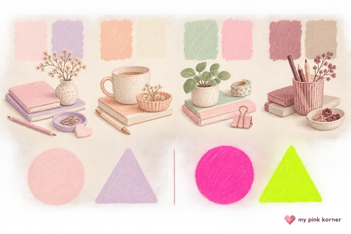
A pastel palette holds lightness above about 76 and chroma below about 30 across every member. So the colours differ from each other in hue and in nothing else. One variable.
A saturated gaming palette does the opposite. Take red, magenta, green, purple, cyan and hot pink. Lightness runs from 40.9 to 91.1. Chroma runs from 50 to 125. Every colour is fighting on three axes at once, which is why pink plus cyan plus purple LED reads as noise and lavender plus butter plus baby blue reads as designed.
Munsell said the same thing in 1905. Successful schemes, he wrote, come from "some sort of balance uniting 'light and shade' (value), 'warmth and coolness' (hue), with 'brilliancy and grayness' (chroma)." Collapse two of the three and the third one carries the whole job, which is exactly what a pastel palette does.
He also gave the area rule, and it's the most directly useful sentence for a desk. "One way is to use more of the weaker color." Large areas take weak chroma, small areas take strong chroma. In practice: the pastel goes on the wall, the desk mat and the rug. The saturated pink goes on the small objects.
Pastel, muted and desaturated are three different things
These get used as synonyms and they're not. Here's the whole thing in one table:
| Term | What's mixed in | Lightness | Chroma |
|---|---|---|---|
| Pastel, a tint | White | High | Low |
| Muted, a tone | Grey | Middle | Low |
| Desaturated | Nothing specific, it describes chroma only | Any | Low |
Desaturated is the umbrella. Pastel and muted are two regions inside it, separated by lightness and not by chroma.
Which is why a muted sage and a pastel mint aren't interchangeable even though both are low chroma greens, and why a muted palette reads as grown up and a pastel palette reads as soft. Same chroma, different lightness, completely different room.
Four palettes that hold, one of them from Pantone
One of these comes from an actual colour authority rather than a mood board.
1. Rose Quartz and Serenity. Pantone's Colour of the Year for 2016, and the only time it has ever named two colours jointly. A warm pale pink against a cool pale blue. If you want one pastel pairing with a citation behind it, this is the one.
2. Lavender, thistle and a near white. All three sit under 17 chroma, all in one hue family. Pantone's 2026 Colour of the Year is Cloud Dancer, a soft white it describes as "a lofty white that serves as a symbol of calming influence", which makes it the neutral this whole palette can sit against.
3. Peach puff, lemon chiffon and baby blue. Lightness 79.7 to 97.6, chroma 22.5 to 26.8. Three hues far apart in a tight chroma band, which is the textbook version of differing in hue only.
4. The pink-forward one, which is what I actually run. A pale plaster pink on the large surfaces, chroma around 14, with periwinkle at 27 as the accent. That's Munsell's area rule applied literally.
Why your pastel setup photographs grey
Your camera is the reason, and there's a number attached.
In-camera metering is calibrated against middle grey, a surface reflecting somewhere between 10 and 18 percent of the light hitting it. Point a meter at anything much lighter than that and it underexposes, because it's trying to drag the frame back to middle grey.
This is the same reason snow photographs grey. The standard correction for a snow scene is around plus one stop of exposure compensation.
Now do the arithmetic for a pastel desk. A pastel palette sits at lightness 80 to 95, which is roughly 57 to 88 percent reflectance. Against a meter expecting 10 to 18. Your phone underexposes a pastel setup by about a stop, pulling every colour toward grey and mud.
The fix is free. Tap to focus on your phone, then drag the little sun icon up. That's exposure compensation and one stop is usually right. Your setup was never the problem, the meter was.
And the corollary worth knowing before you buy. Listing photos of pastel products are systematically unreliable in a way listing photos of saturated products aren't, for exactly this reason. That's one more argument for the two-number test above.
The two things that age a pastel setup badly
First, plastic yellows. Pastel is the palette that shows it worst.
ABS plastic yellows when exposed to ultraviolet light or excessive heat. The mechanism is photo-oxidation, which breaks polymer chains and turns the plastic yellow and brittle over time. The base state of ABS is a translucent ivory white with pigment added on top.
So the shift is toward yellow, on a material that started off pale. On a black housing you would never see it. On lavender, mint or baby blue, where the total colour signal is small to begin with, the yellow is the first thing you notice. Keep pastel gear out of direct window light, and where you get the choice, pick PBT over ABS.
Macaron pastel PBT double shot keycaps are the straightforward version of this, and there's a dagaladoo Cherry profile PBT set, a jelly pink MOA set, a dye-sub ice cream set, a sea salt cat 142 key set and a 132 key jelly MOA set if you want options. All of those are PBT, which is the point. There's more on boards themselves in the pink mechanical keyboards under 100 comparison.
Second, and this one is a physics problem rather than a wear problem. An LED can't output a pastel.
Pastel is a property of a surface, made by mixing a pigment with white so it reflects a lot of light at low chroma. An LED emits. Set a strip to a lavender value and what comes out is a saturated purple at reduced brightness, because there's no white to mix in. On camera it reads as purple every time.
So the pastels in a pastel setup have to be objects, not light.A lavender leather desk mat at 36 by 17, a purple scalloped mat, a kawaii purple mat or a silicone writable mat are dyed and moulded surfaces, which hold a pastel reliably.
The light's job is to be warm and dim, not coloured.A 2700K COB strip with high colour rendering or a 95 CRI version lights pastel objects properly, where a colour-changing strip set to lavender fights them. A dim-to-warm bulb or a 95 CRI studio bulb does the same at room scale. Whether LED panels are worth it goes into the panel version of this.
For the large surfaces, a lavender fluffy area rug or a purple floral 5 by 7 covers the floor. Light pink blackout curtains cover the window. A blush macrame hanging adds the texture without adding a fourth hue.
Boards in the right family, if you want the whole desk to agree: a YUNZII C75 in blue, a sage green keyboard and mouse set or a DAREU in sakura pink.
What I'd buy first
The desk mat, in the pastel you want the room to be.
It's the largest surface and it's a dyed material, so the colour holds. Munsell's area rule says the weak chroma belongs on the big shapes. Every small thing you add afterwards gets judged against it.
Second, a warm white light rather than a coloured one. This is the single most counterintuitive thing here. A pastel palette needs light that renders colour well and stays out of the way. Coloured light overwrites the pastels you paid for.
Third, the neutral. White, cream or pale wood between your two pastels. Free if you already own a tray or a riser.
What I wouldn't do: buy a mint green anything without checking its chroma. Set an LED strip to a pastel preset and expect a pastel. Put ABS keycaps in a sunny window.
Coming here from pink, the pink setup ideas post has 34 of them with nine that cost nothing. My own desk is where the plaster pink and periwinkle pairing actually lives. The 12 things that actually matter is the buying order underneath all of it.
For the room around the desk, pink gaming room ideas for renters covers walls, windows and floors. How to hide cables on a small desk is what stops a pale desk looking busy. If you're buying for somebody else, the cozy gaming gift guide and pink gaming gifts under 25 are the two I'd start with. Everything I own is on my faves and there's more about me on my about page.
Pastel setup FAQ, the questions I get asked most
What makes a colour a pastel?
High lightness and low chroma. it's a tint, meaning a colour mixed with white. Mixing with white is what drops the chroma. A practical test is lightness above 80 and chroma below about 30.
Is pastel the same as low saturation?
Only in HSV. In HSL the canonical pastel colours are 72 to 98 percent saturated, near the top of the scale. The shorthand everybody repeats is copied from a definition that holds in one colour space and not the other.
Is mint green a pastel?
The common web colour called mint green isn't. Its lightness is 91.9, which is why it photographs as pastel, but its chroma is 64, which is more than double the pastel ceiling. it's a light saturated green.
What's the difference between pastel and muted?
Pastel is a colour mixed with white, so it stays light. Muted is a colour mixed with grey, so it sits in the middle. Both are low chroma, which is why they get confused.
Why do my pastels photograph grey?
Your camera meter is calibrated for a surface reflecting 10 to 18 percent of light, and a pastel desk reflects far more than that, so the meter underexposes by roughly a stop. Add exposure compensation, the same correction you would use photographing snow.
Can I get pastel LED lighting?
Not really. Pastel is a property of a surface that reflects a lot of light at low chroma. An LED emits light with no white to mix in, so a pastel preset outputs a saturated colour at low brightness. Keep the pastels in the objects and the light warm.
Why do pastels go together so easily?
Because they share a chroma ceiling, so the only thing separating them is hue. Saturated palettes vary in lightness and chroma as well, so three things compete at once.
Do pastel keycaps go yellow?
ABS does, through photo-oxidation from ultraviolet light and heat. The shift toward yellow is most visible on pale low-chroma colours. PBT is the better choice where you have it, and keeping the board out of direct sunlight helps either way.